Non-profit organization
Aug 2022 - May 23 2023
UI&UX Designer
Group of 7
Figma/Miro
Project Rebound is a program that assists formerly incarcerated individuals in succeeding in higher education at California State Universities. I was a part of Aakash's lab at San Francisco State University, where I collaborated with team members to support digital literacy for returning citizens. This website was built from the ground up, with no pre-existing foundation.
In today's rapidly evolving job market, having digital skills is crucial. Yet, for returning citizens, there's an obstacle: limited digital knowledge. Not having digital skills makes it harder to succeed in college and to get job opportunities.
The goal of this project is to assist returning citizens in learning digital skills, thereby enhancing their success in college and expanding their job opportunities.
Helping returning citizens learn digital skills isn't clear and simple. Just having things like a Frequently Asked Questions (FAQ) or a forum won't be enough to fix the issue. How can we find the most appropriate solutions that address the specific needs and challenges of this group of people?
In order to gain a clearer understanding of users' needs and the problems associated with learning tech in general, we used qualitative methods - user interviews. This approach enabled us to engage in in-depth conversations and gain valuable insights.
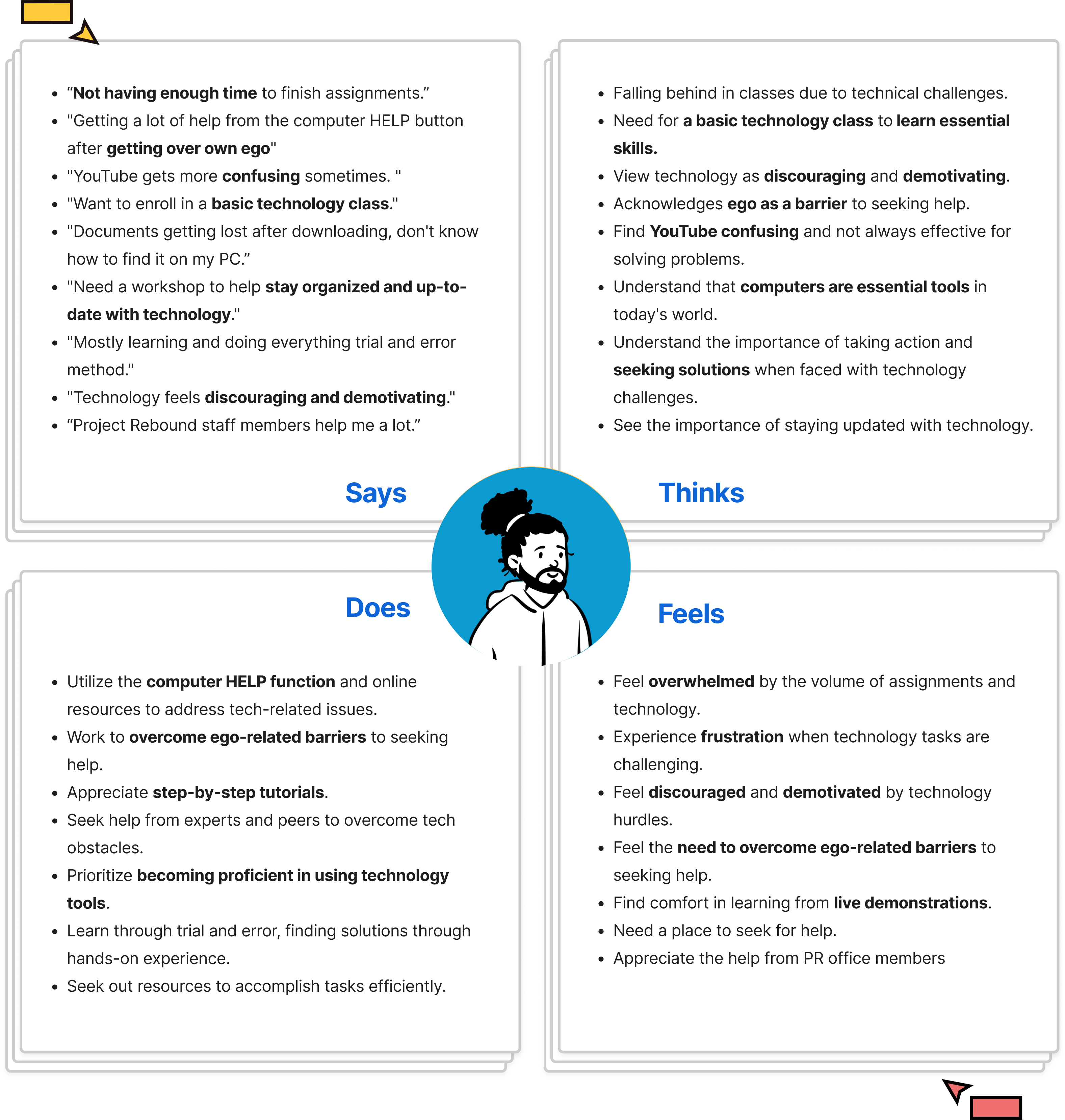
At an early stage, we interviewed 6 Project Rebound students to directly gather the students' perspectives, understand their challenges, and identify needs when it comes to technological issues.
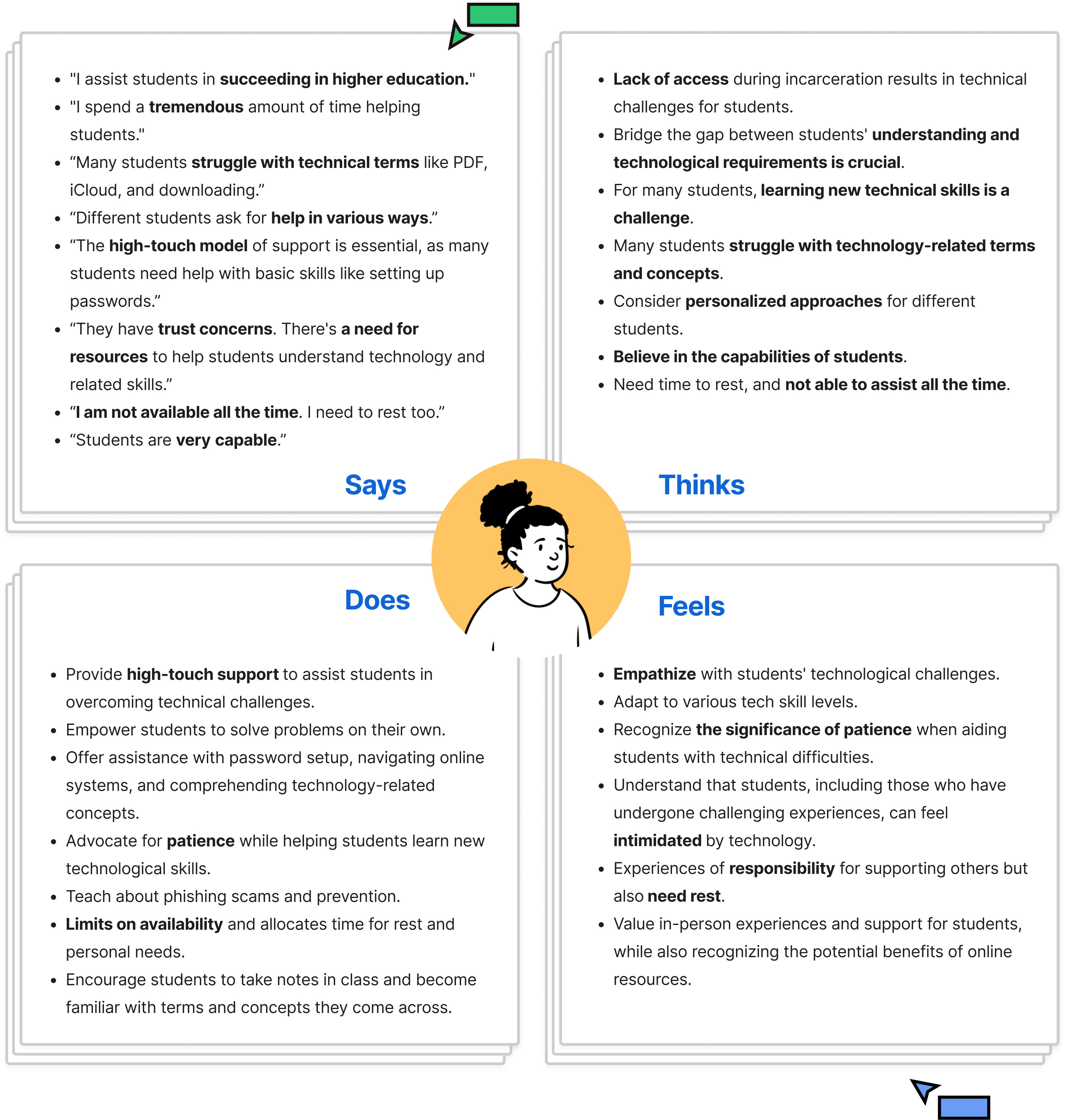
We also interviewed 3 Project Rebound staff members to understand how they support students. Their experience in assisting users has made them experts in identifying the challenges students face and guiding us on where to focus.
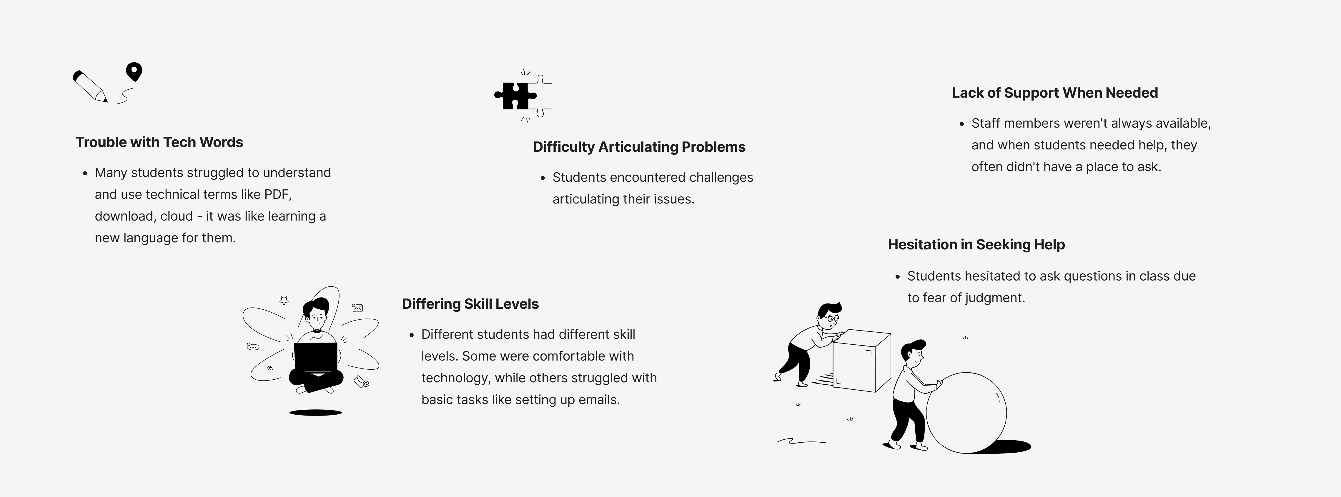
After the interviews, 5 major problems emerged as the most significant challenges:
• Trouble with Tech Words
• Differing Skill Levels
• Difficulty Articulating Problems
• Hesitation in Seeking Help
• Lack of Support When Needed
After completing our research, I created a storyboard to visually represent the users' pain points. This aids in providing a clear and concise visualization of the challenges users were facing. It also helped the rest of the team empathize with the users.
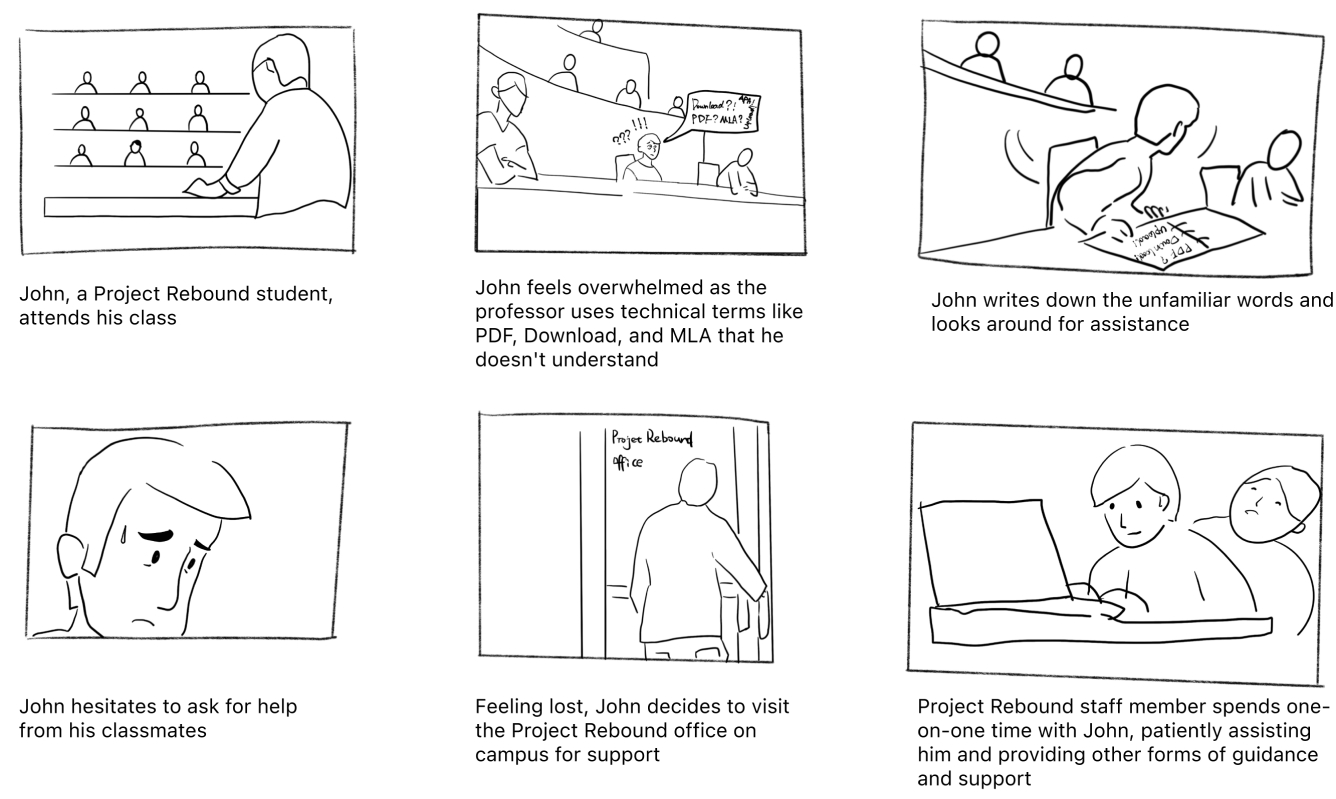
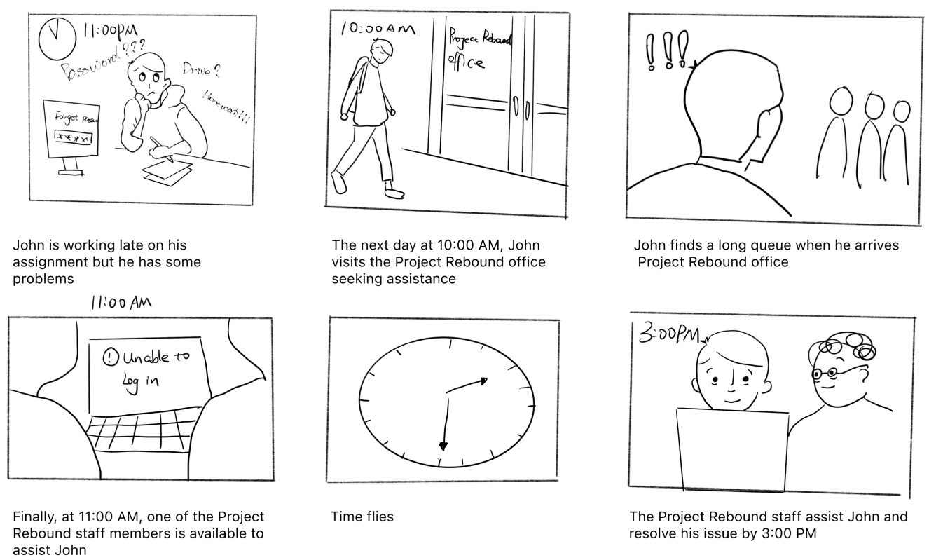
Based on the initial research, we discovered that students had different levels of familiarity with technology. While some were comfortable searching for information online independently, most struggled with technical terminology. Another concern was that when staff members were unavailable, students had few other people to ask for help. As a result, providing support has been identified as the second priority. Therefore, we have prioritized the following problems:
How might we simplify technical terms to make them more understandable for students?
How might we support students when Project Rebound staff members are not available?
How might we create tailored learning pathways to accommodate students with varying tech proficiency?
How might we provide tools to help students share their problems more effectively?
How might we encourage students to seek help without hesitation?
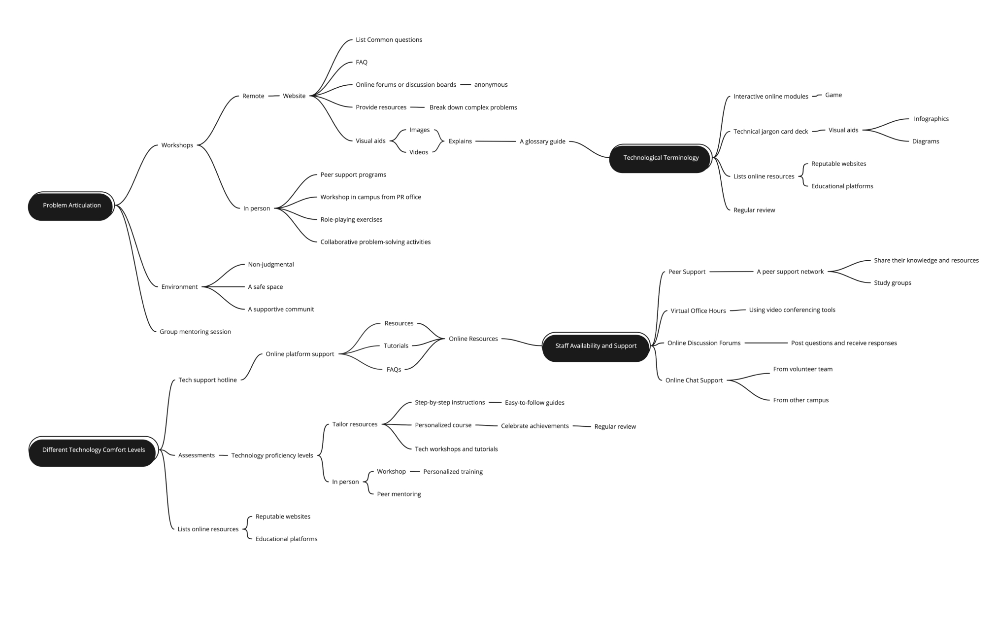
We brainstormed the potential concepts, and later I organized them into a framework for analysis.
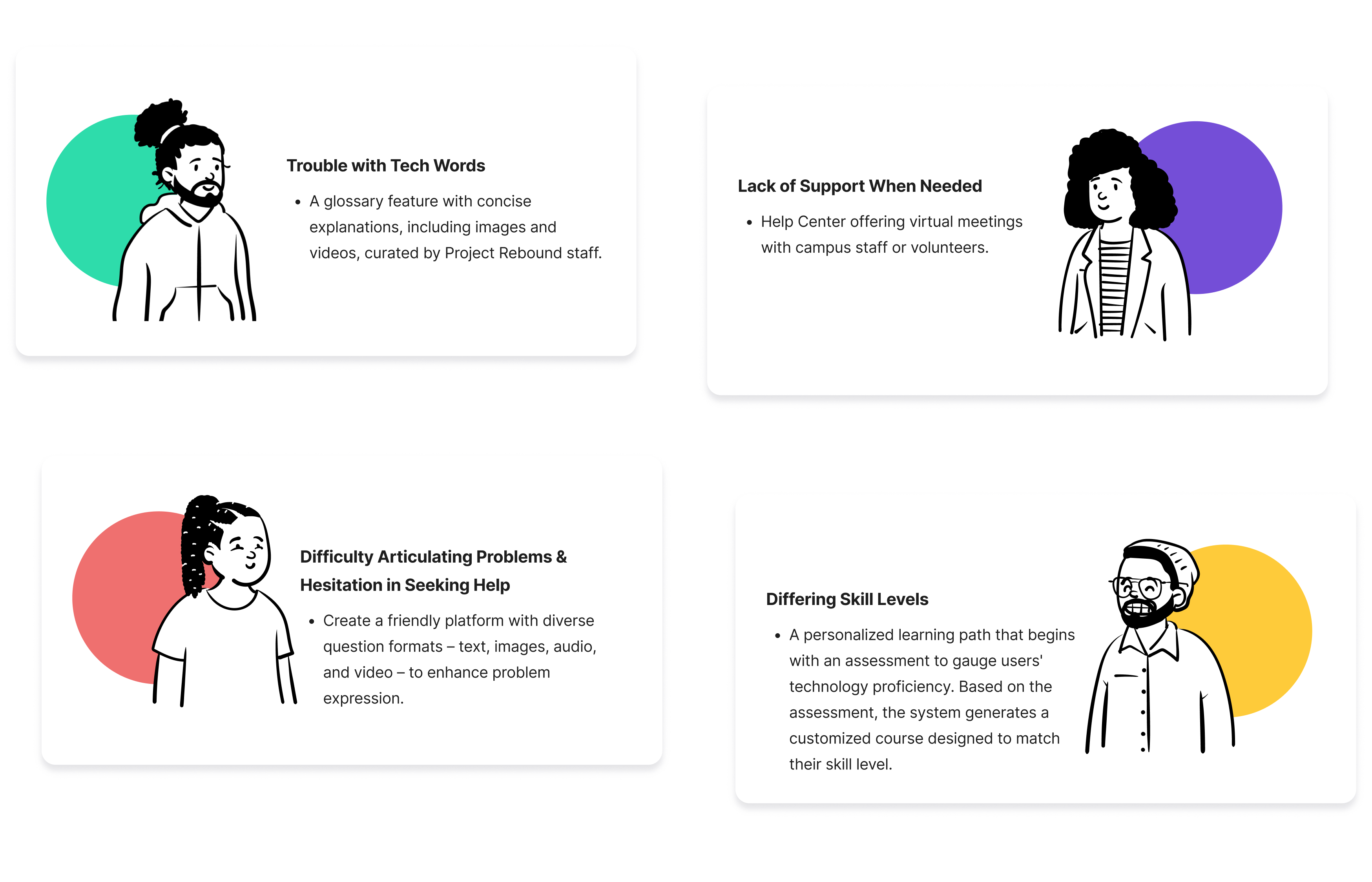
Drawing from ideation insights, I outlined scenarios for each problem and devised strategic approaches to address them.
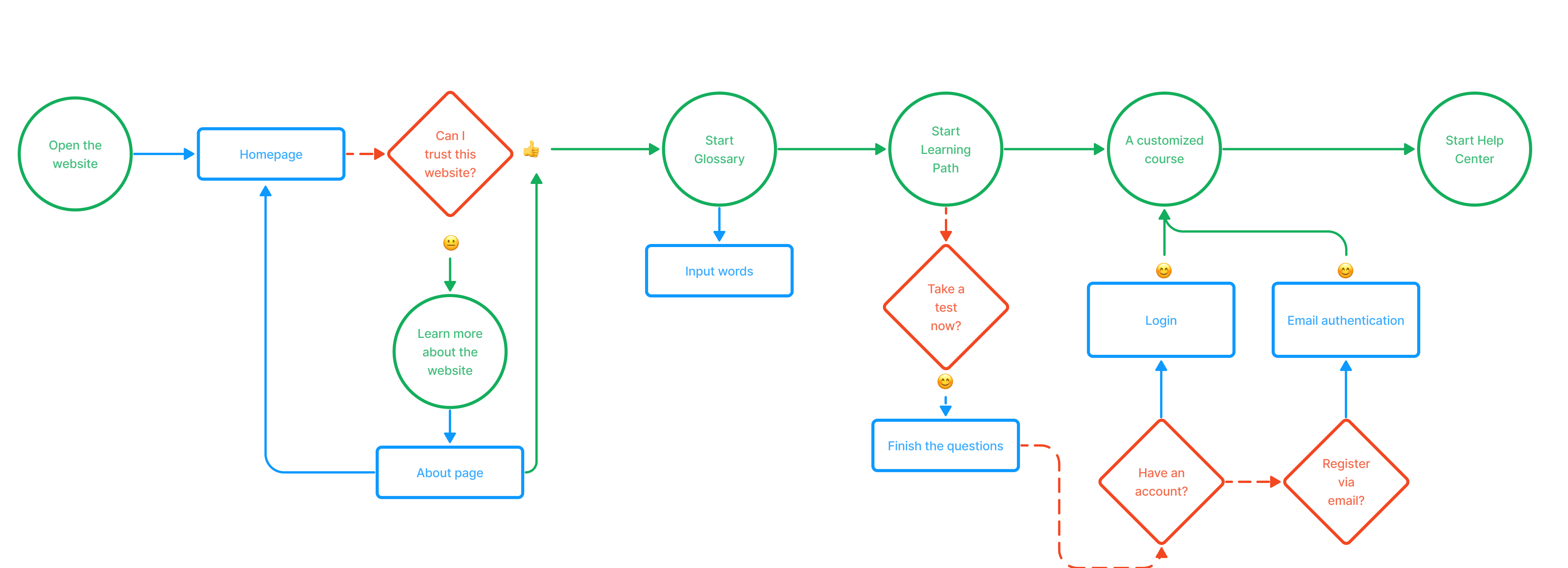
I sketched a simple user flow to arrange information in a way that makes it understandable for later use in wireframes.
After our team collaborated to identify and discuss the core pages and functionalities that needed to be included.

After finalizing the wireframe, I used Figma to create a design system that included colors, fonts, and other design elements. Then, I used this design system to create high-fidelity versions.
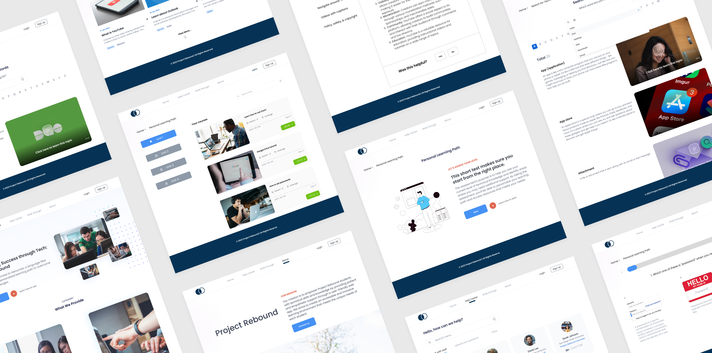
To assess the effectiveness and usability of the design, we conducted usability testing, gathering valuable feedback and insights.
Internal critiques for initial feedback using Nielsen Norman Group's 10 Usability Heuristics for User Interface Design as guidelines.
We tested the website with Project Rebound users, watching them complete tasks and observing how they interacted with it.
With the final test, participants had positive impressions of the prototypes overall. However, three major areas were identified for improvement based on their feedback.
Users suggested adding 'Common Terms' that students would use in class or encounter to make the feature more useful.
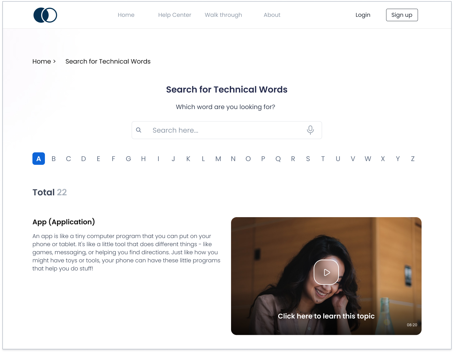
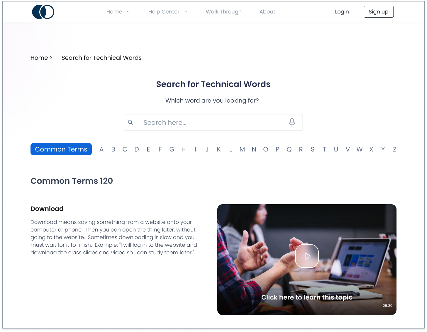
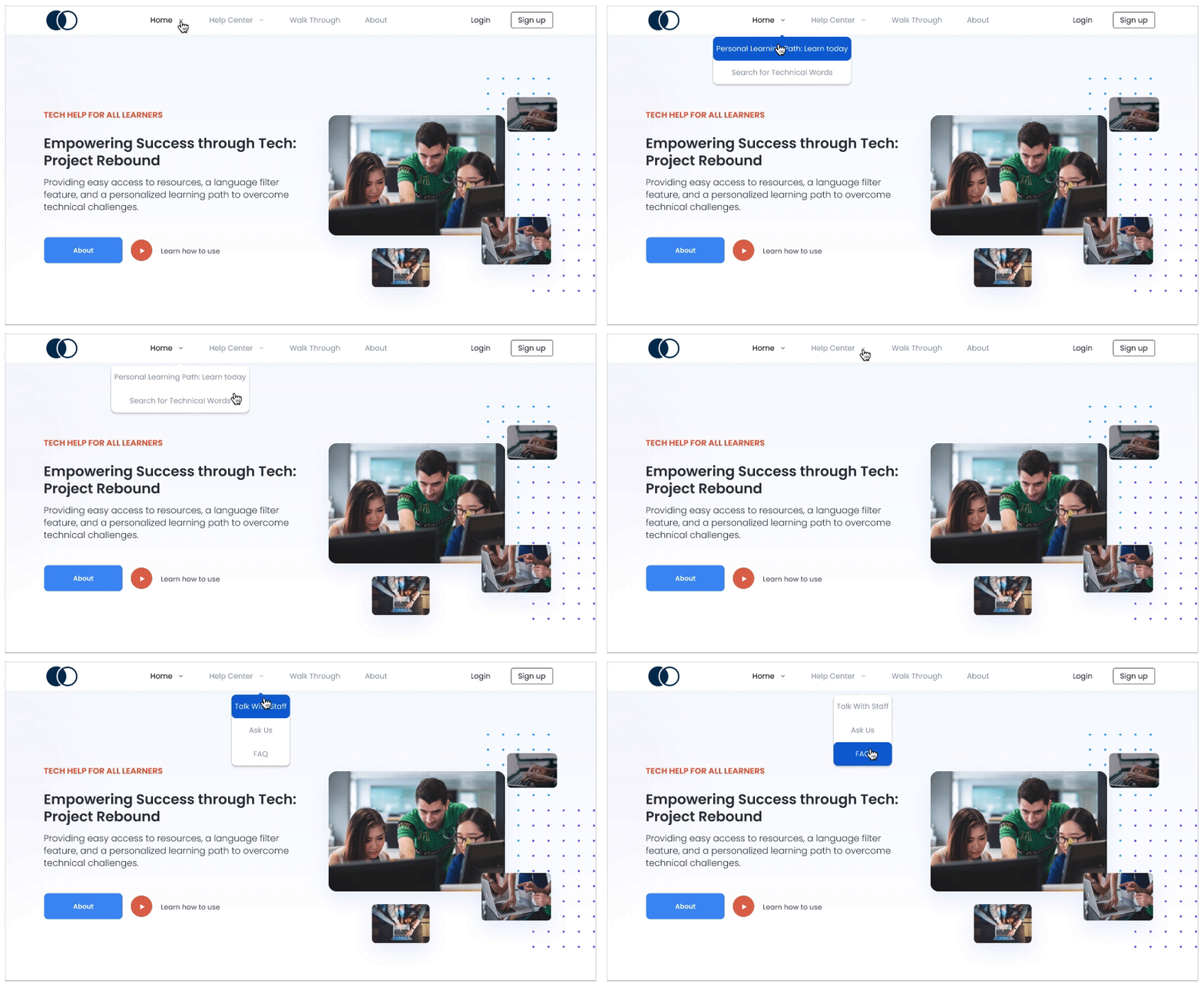
I observed that users were experiencing difficulties navigating to each sub-page. They had to go back to the homepage to access features. To enhance navigation, we replaced the navigation bar with a dropdown menu, improving accessibility and making it easier for users to find and access both the homepage and sub-pages.

Enhance test navigation by adding progress indicators and question navigation buttons. Users can track their progress and easily move between questions.
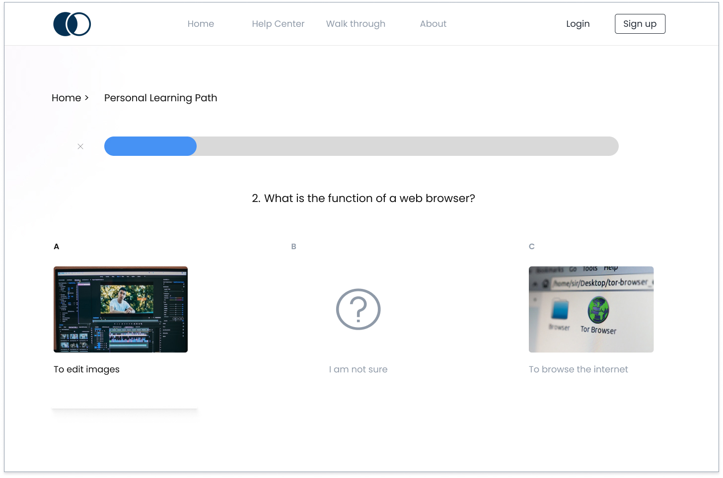
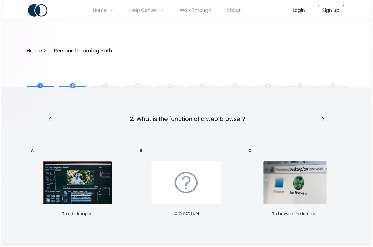
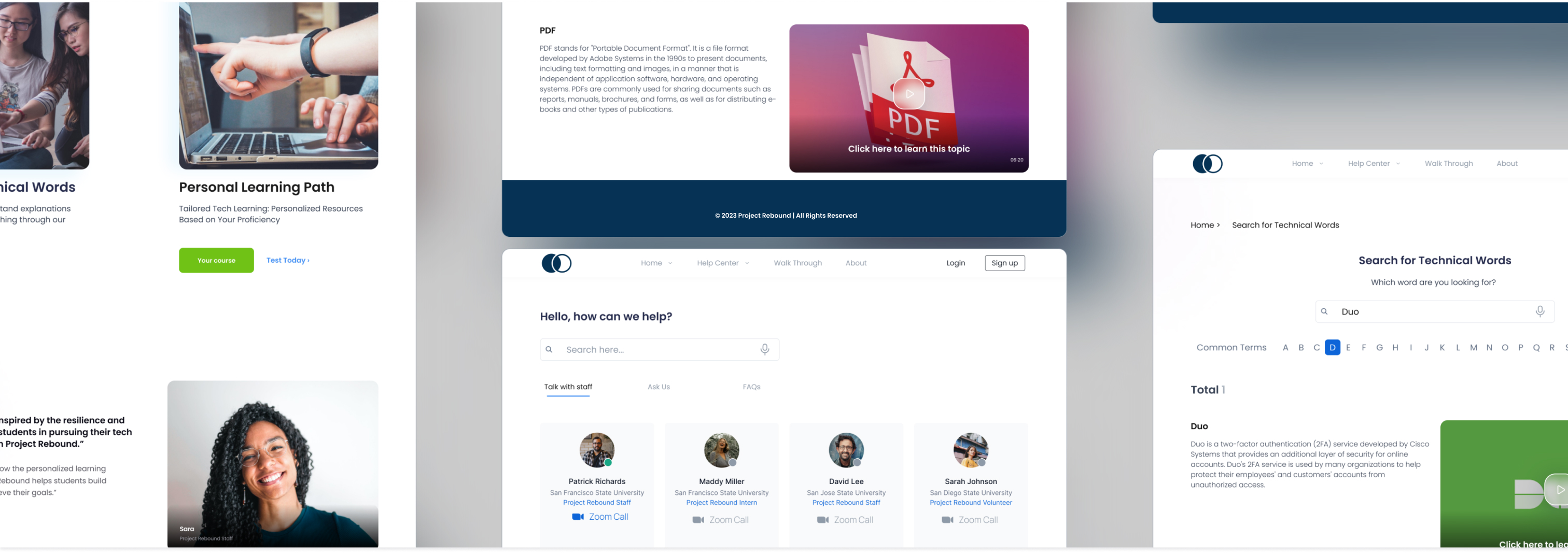
In today's fast-changing job market, having basic digital skills is vital, especially for those rejoining society after incarceration. Our project aims to close the digital gap and provide essential support to each Project Rebound student, helping them acquire crucial digital skills. After incorporating all the feedback from usability testing, we released the final version with positive responses.
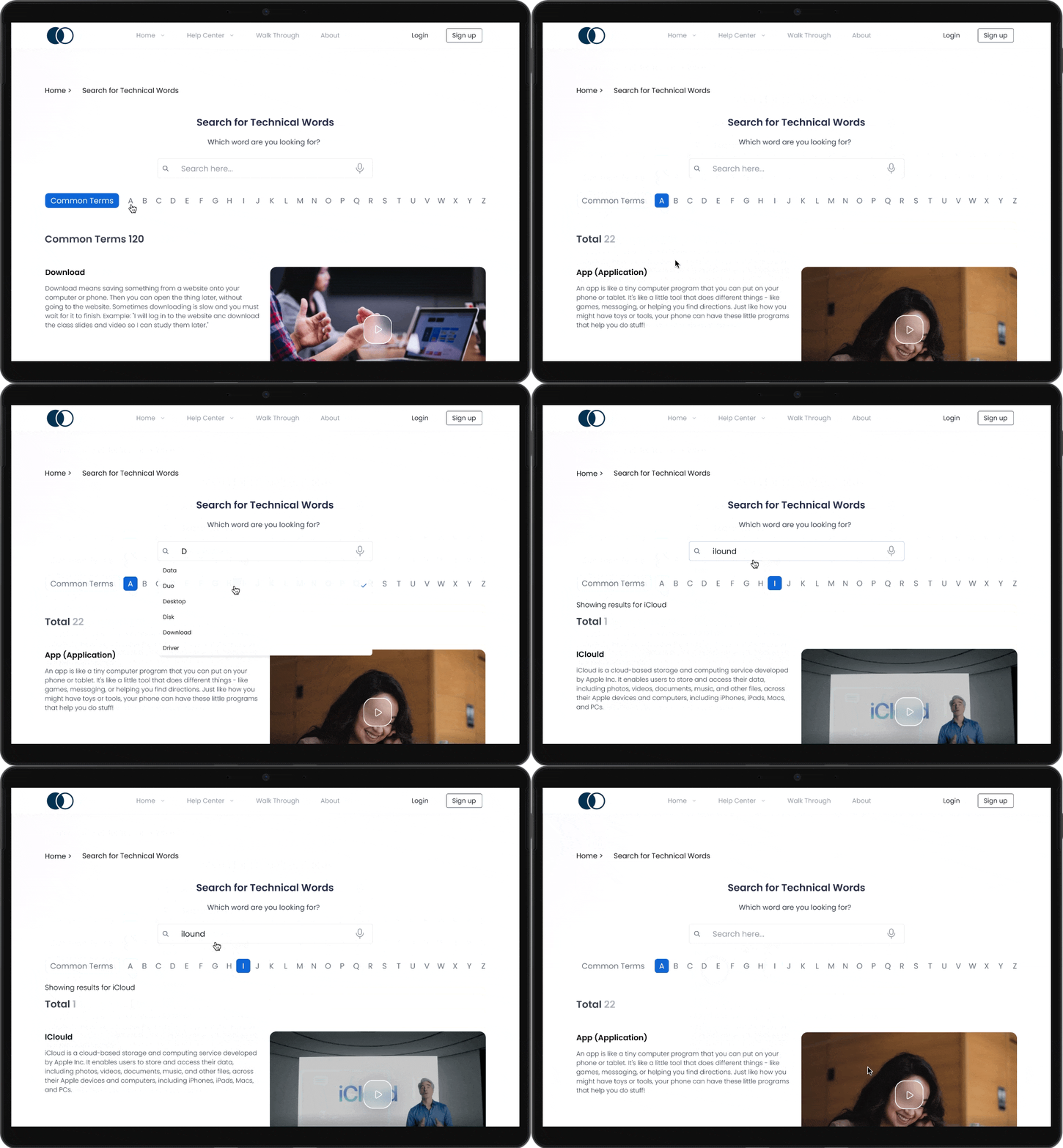
- The contents are carefully curated by the staff of Project Rebound to match the students' level of understanding.
- It facilitates intuitive searching through alphabetical organization.
- Enriched with explanations, visual guides, or videos, it promotes efficient learning.
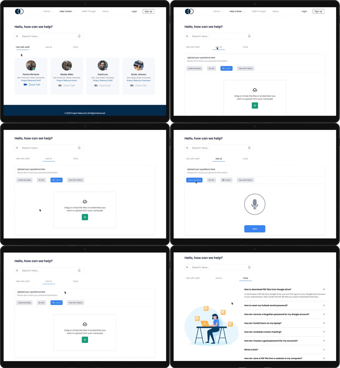
- Improving the visual layout to assist students in locating their needs.
- Adjusted to students' preferences, it enables audio questions with screen captures, prompt responses from online staff, Zoom for assistance, and access to a FAQ section for common queries.
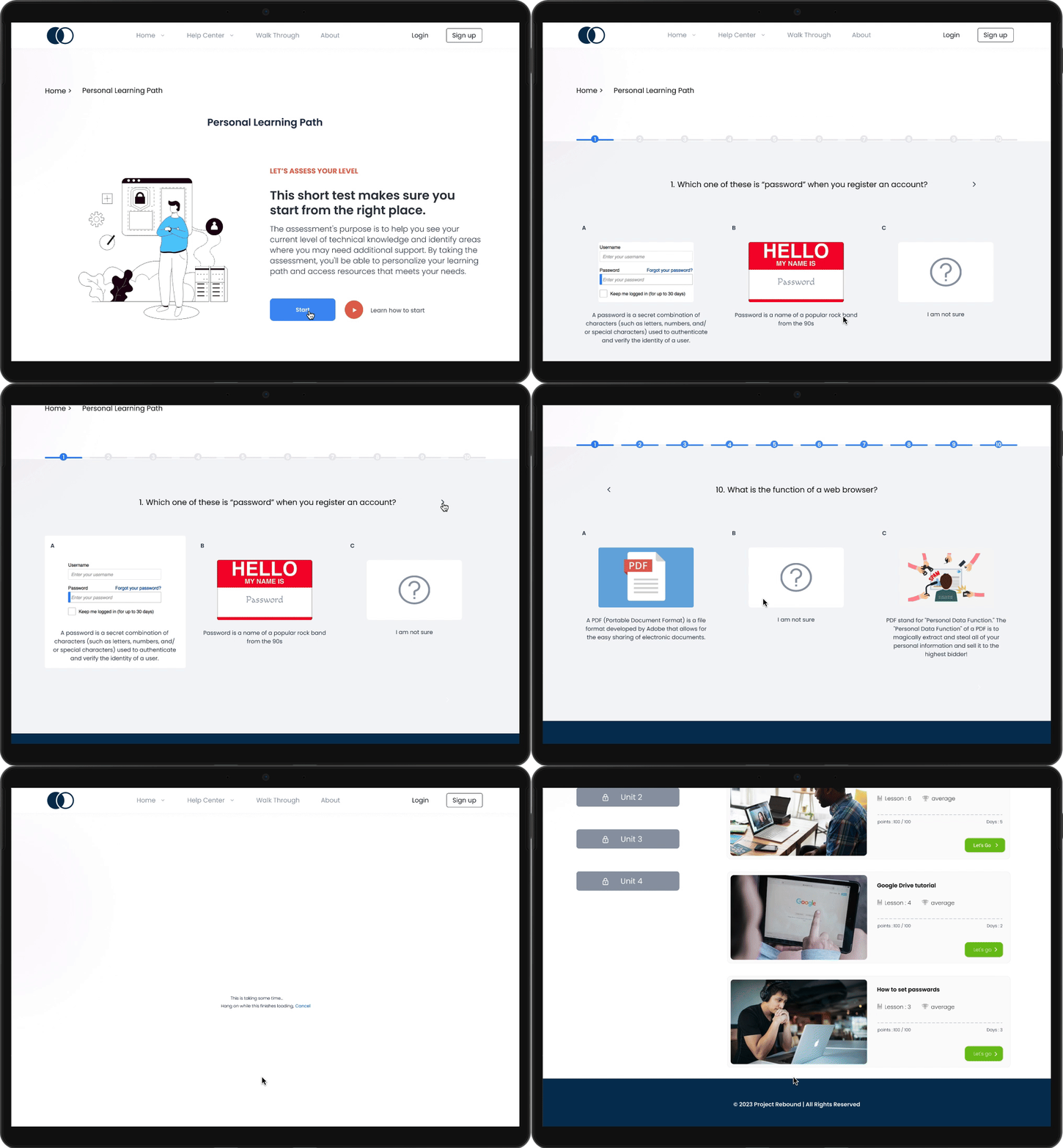
- By conducting assessments to gauge users' technological proficiency, a personalized course is crafted to match their skill level.
Empathy with the user is a fundamental principle for UX designers. It is especially important in this project, as the user group has unique needs and challenges. To create a tool that assists them, it is essential to be a good listener and observer, deeply connecting with their pains and difficulties.
Insights are not a one-time affair, they continue to hold value throughout the design process. They act as a guiding compass, ensuring we stay on the right track. Regular reflection on these insights is crucial to assess whether the design effectively addresses the identified problems.